Friday, April 29, 2011
Doweling Jig by Nate Strehler

Drawer Handle by Jerry Schaffer
Double Bearing by Steven May
Wednesday, April 27, 2011
Dedication to David Carson
Neville Brody and David Carson
David Carson
Born September 8th, 1952 in Corpus Christi, Texas, but moved to New York City four years later.
Carson was a high-school teacher before he was a graphic designer.
First actual contact with graphic design was made in 1980 at the University of Arizona on a two-week graphics course. He attended San Diego St. University as well as Oregon College of Commercial Art. Later on in 1983, Carson was working towards a Bachelor of Arts in Sociology when he went to Switzerland, where he attended a three-week workshop in graphic design as part of his degree.
Carson was also a professional surfer and in 1989 and qualified as the 8th best surfer in the world. His career as a surfer influenced his designs along with his various wolrd travels.
Famous for pushing the boundaries of design he is considered one of the most famous graphic designs on the planet (as described by creative review magazine). Carson is famous because he has influenced graphic design immensely through his use of type, approach and technique, which does not follow “traditional” graphic design standards. Many designers changed their methods and based their style from Carson’s work, which they consider “new” standards. He highly regarded for this but also through his use of combining photography and typographic elements, he manages to communicate both idea and feeling in his designs.
David started his own business called David Carson Inc and has agencies in Del Mar, California and Zurich Switzerland. He lectures all around the world. He is well known for his photography and graphic design pieces but has ranged out into other mediums e.g. directing commercials and videos. He has also written many Books including The end of print, which has been the best selling Graphic design book ever written to date and has appeared in over 180 magazines and newspaper articles. His website www.davidcarsondesign.com/ is very basic with no side links. This website is focussed primarily to focus on the body of the website and not the headings. Because he moves around a lot he needs to work in a mobile work studio.
Neville Brody
Neville Brody's work has been deemed uncommerical as his work often puts heavy heavy emphasis on safe and tested economic strategies as opposed to experimentation. During the punk rock fase in london he was almost thrown out of college for putting the Queen's head sideways on a postage stamp design, which beganhis design career of questioning the rules of society and design.
Brody largely made his nam through his revolutionary work as Art Director for the magazine "The Face" in 1980 when it was first published. He has pushed the boundaries of visual communication in all media thorugh his experimental and challenging works. He also designed (with others) the coporate identity for the House of World Cultures in Berlin. He was one of the founding members of Fontworks and there designed a number of notable typefaces. He also co-produced FUSE, which is a project that is a published collection of experimental typefaces and posters which challenge the boundaries between typography and graphic design.
He has published two books and have a combined sale of over 120000 copies and had over 40000 visitors at his exhibition in London before he started touring.
Neville Brody's online presence is very vast. Information about him and examples of his work are on many websites such as researchstudios.com (which he founded), designyatra.com and even on the Mac section of the Apple website. There are also interviews avaliable to watch online on vimeo.com. His vast collection of fonts, including Insignia and Blur, appear on many websites that are available for download or purchase, such as identifont.com, fontfont.com, fontshop.com, fonts.com, itcfonts.com and myfonts.com.Neville Brody was born on the 23rd of April, 1957 in London, England. He studied Graphic Design from 1977 to 1980 at London College of Printing, and at the Hornsey School of Art. His influences include 20th Century Avant-Garde design, and Russian Constructivists El Lissitzky and Alexander Rodchenko.
David Carson
Born September 8th, 1952 in Corpus Christi, Texas, but moved to New York City four years later.
Carson was a high-school teacher before he was a graphic designer.
First actual contact with graphic design was made in 1980 at the University of Arizona on a two-week graphics course. He attended San Diego St. University as well as Oregon College of Commercial Art. Later on in 1983, Carson was working towards a Bachelor of Arts in Sociology when he went to Switzerland, where he attended a three-week workshop in graphic design as part of his degree.
Carson was also a professional surfer and in 1989 and qualified as the 8th best surfer in the world. His career as a surfer influenced his designs along with his various wolrd travels.
Famous for pushing the boundaries of design he is considered one of the most famous graphic designs on the planet (as described by creative review magazine). Carson is famous because he has influenced graphic design immensely through his use of type, approach and technique, which does not follow “traditional” graphic design standards. Many designers changed their methods and based their style from Carson’s work, which they consider “new” standards. He highly regarded for this but also through his use of combining photography and typographic elements, he manages to communicate both idea and feeling in his designs.
Neville Brody - Why's he Famous
Brody largely made his nam through his revolutionary work as Art Director for the magazine "The Face" in 1980 when it was first published. He has pushed the boundaries of visual communication in all media thorugh his experimental and challenging works. He also designed (with others) the coporate identity for the House of World Cultures in Berlin. He was one of the founding members of Fontworks and there designed a number of notable typefaces. He also co-produced FUSE, which is a project that is a published collection of experimental typefaces and posters which challenge the boundaries between typography and graphic design.
He has published two books and have a combined sale of over 120000 copies and had over 40000 visitors at his exhibition in London before he started touring.
Monday, April 25, 2011
Friday, April 15, 2011
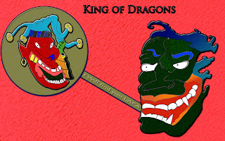
Task C: A line is a dot that went for a walk
 |
| Started to sketch the face of the green dragon first. |
 |
| Then went on creating its teeth, make it look of a angry impression. |
 |
| Then went on sketching it's eyes. |
 |
| Then I started sketching another face dragon which is the Red one. |
 |
| Then I went on sketching his teeth and tongue. |
 |
| Sketching his nose by make it look evil. |
 |
| Sketching his evil eyes by make it into a tiger type eyes. |
 |
| Then I went on sketching these little face gold balls that is used on top of his head. |
 |
| Skteching the eyerings both sides and a leaf on the right side representing his symbol. |
 |
| Then i went on sketching three cigaretts. |
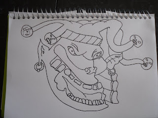 |
| Finally i have finished sketched my final design of the bad face dragon. |
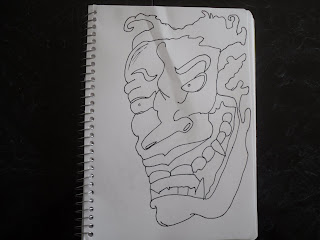 |
| Finish my final sketch of the good face dragon. |
CD Cover part 2
 |
| The name of the font i used for the DJ Pato is 'Fat boy graffiti' Font. |
 |
| I've also used the Fat Boy graffiti font for the text. |
 |
| I have sketch the DJ Pato logo on my visual diary. |
 |
| I have sketch the back cover of the CD by using a fineliner at the end. |
 |
| I have sketch the front cover of the CD by using a fineliner at the end. |
Wednesday, April 13, 2011
3D Tool Post Assemblies by Matt Kertai
Machine Vise 3D Model by Justin Corl
Isometric Hip Roof Drawing by Thomas Manges
3D Hearts by Deborah Neubaur

Flanged Coupling by Adam Brinkhoff
Thursday, April 7, 2011
Friday, April 1, 2011
Music Packaging CD Cover
 |
| 1. Design of the my font CD cover sketched on a visual design and used fine liner to trace liner |
 |
| 2. Design of the back CD cover playing with different abstract fire types lines. |
 |
 |
| 4.Then after it was sketched on my visual diary i used the fineliner to trace it. |


