Tuesday, March 29, 2011

Winter in Wagga Wagga Style guide


Winter in Wagga Wagga logo

SALADINO VILLA

Images: Susan Burns, Coldwell Banker Website 


John Saladino's eclectic style combines classical principals of color, scale and lighting with modern and vintage elements to create one of a kind interiors. When studied in parts or as whole projects, there is not one detail that is missed and every view is in itself a moment, a vignette.

Truly indescribable in words, inspiration can be found at his website, or at the Saladino Villa, for sale in Montecito, California (shown below).


Sunday, March 27, 2011

Title Sequence


This is my attempt on how to make an animation move with three basic tools to create a title sequence movie. Basically i used a text font "Title Sequence" and two shapes to move around by using a timeframe underneath where you can allocate how many minutes or second you can move your shapes and text. The timeframe went for 5 seconds long and created a small animated theme for practices only.        

Sunday, March 20, 2011

3D Repousse


This is my first attempt of how to make the font and image a 3Dimensional shape with a shadow on photoshop CS5. I have used the Gradient tool to effect the colour dark and light tone. Basically used my name Jorge and a square shape to create the shadow and the light.    

Wednesday, March 16, 2011

Assessment one - Rubbish font


This is my design of my rubbish font that i used on adobe Photoshop program. I've created my own alphabets fonts that says "rubbish" by sketching out onto a small visual design before i began to photoshop this font. The tools that i used in photoshop to develop and design this rubbish font are basically blending options, polygonal lasso tool, magic wand tool and a little bit of sharpen tool that I have used to play around with the rubbish font. Firstly i opened up the two files with the rubbish font sketch and the rubbish theme that I taken a photo off.

 So i used the magic wand tool to drag the rubbish font onto the rubbish photo theme and basically used the polygonal tool to cut around the alphabets one by one straight and perfect, it was cut onto rubbish theme layer. Then used the magic wand tool to place all the alphabets into the right position which says ' Rubbish' font. Secondly, i started used blending options and played around with different effects to show which styles stands out the most. I want my font to look a bit of a 3D appearance and show the shadow around each of the alphabets. Then lastly, i created to two basic arrows underneath and below the rubbish font that creates a bit of a background so it doesn't look plain. 

This is steps that i used to create the rubbish font by sketching, scanning and taking photos.   


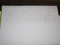
1. Sketch my own rubbish font onto a small visual diary.

   
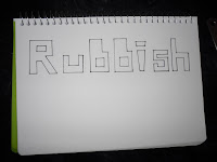
2. I used the fine liner pen to trace the alphabets.
 
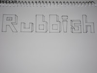
3. I started to sketched into a 3 Dimensional shape with the alphabets.   


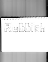
4. Then I place the visual diary on scanner . 
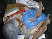
5. Then took a photo digital image of my recycling bin with rubbish.   


Tabs

We had to use tabs in indesign and copy and remake part of a stats report. Guess which ones mine.

Recreating Packages


Monday, March 14, 2011

Hip Roof Isometric by Salvador Perez

This complicated drawing was created for extra credit in 2011. It shows the double top plate, ridge board, common rafters, hip rafters, hip-jack rafters, and ceiling joists. Good work, Salvador!

Sunday, March 6, 2011

This is my first photoshop intend work, basically uploading images from google search like the bread, glass of milk and a red table. I use the magnetic tool to cut the bread and glass of milk onto the table and used transform to adjust the size of the images and play around with it. 

Tuesday, March 1, 2011

typography take two


It's just a little bit different because i felt it needed something else there.. don't no if it quite works.. but im happy, maybe one day I'll work out how to make it work.